My first WordPress blog was a work of art.
It was called Nice Banana and I created it to sell the tropical shorts I’d made with a friend. But before selling hard, I was going to blog my heart out and ramp up our email list. So I slaved over every detail, obsessed over the layout, and perfected each and every blog post.
And then, like so much art in the world, it just sat there. No one saw it. I converted 34 total people to my email list over 3 months.
What happened?
Well, I’d created a WordPress blog that made converting a hassle. Instead of designing for email signups, I’d designed for style. My email capture form was almost hidden and I only used a single pop-up. I expected readers to seek out my email captcha with a passion. For all the time I spent creating great content and showcasing my product, no one shared their email.
Like much art, my conversion process required interpretation. Not good for conversions.
Now I work in marketing and find my artistry in a well-executed design that drives conversions through consumer psychology and best practices. Were I to remake the Nice Banana WordPress site, I’d optimize it to fuel email signups and position my content for success – instead of hoping for the best and getting nowhere.
Read here for the 11 actionable ways to optimize your WordPress blog that will deliver huge increases in email conversions and help your content shine.
Now, let’s peel this thing.
[optin-monster-shortcode id=”rii0kkzkmqeiwl7o”]
#1 Actionable CTA Copy
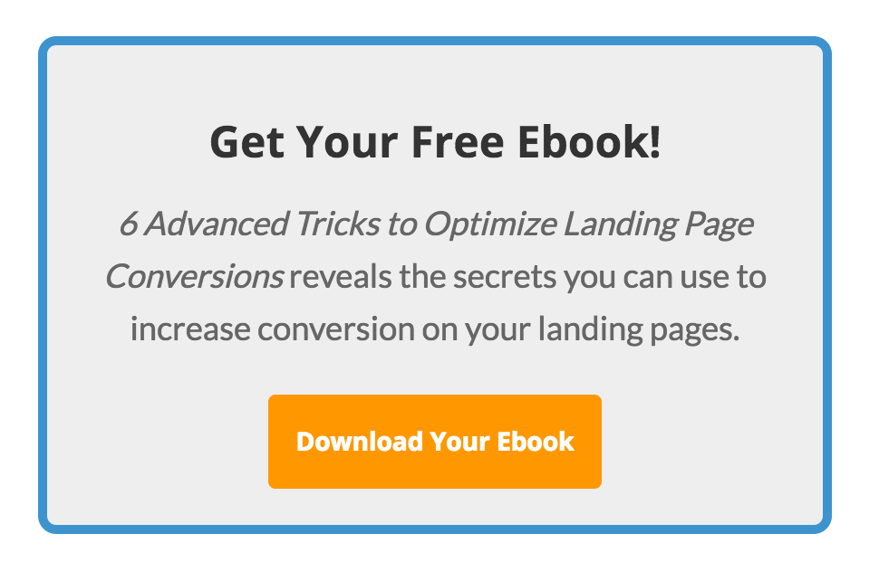
(Source)
Actionable language on CTA boxes and submit buttons drives conversions. Active verbs are key because visitors respond to directions but aren’t so great at intuiting the action you want them to take. Here, the active verb “Get” drives the viewer to fulfill the “Download” action.
Be sure to emphasize value and relevance, as visitors are selfish with their time and scan for benefits foremost. With online readers looking at hundreds and sometimes thousands of lines of text per day, make your conversion opportunity work for you by taking charge of the conversion process.
CTAs are best made irresistibly clickable. The value proposition should shine out, the button should have an exciting color, and be sufficiently large to attract attention. An enticing, bold CTA with a great color and smart copy is the direct, visual route to better conversions.
#2 Add an Opt-In at the End of Articles
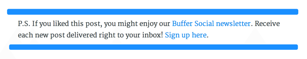
(Source)
Imagine you’ve just finished reading an awesome blog post. The headline hooked you immediately. The content was well written and valuable. By the end, you’re feeling good about that company, right?
Enter the postscript opt-in. There’s no better time to ask for subscribers for their email than when the positive feelings are fresh and visitors are still on your site. Like Buffer does, you could drop readers a simple P.S. and prompt them to sign up for your newsletter. It’s important to ask for emails across many areas of your WordPress blog, and this is a premier location.
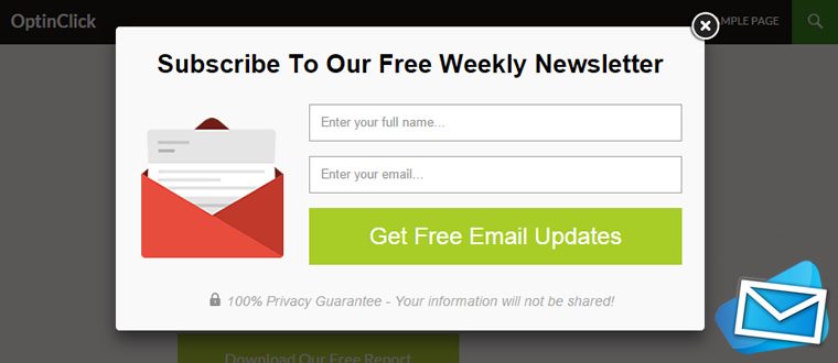
#3 Validate Yourself With Social Proof

(Source)
“The one thing we did to improve conversions was make the site more human — faces, quotes, case studies, etc.” –Walter Chen, CEO iDoneThis
Here we see Opt-In Monster making great use of customer testimonials to secure conversions. After all, people love to see and hear from other people. The SaaS company knows social proof – the psychological principle that consumers trust the word of other consumers – is a powerfully effective tactic for boosting brand trust and opt-ins. Word of mouth like this validates the decision of the subscriber while making them feel that they might miss out on something others found value in.
Social proof includes:
- Customer testimonials
- Badges, certifications, awards
- Trust symbols such as brand logos
- Interviews by media outlets
- Prominently published articles,books, speaking events (thought leadership)
- Being followed by experts in your industry
- Number of email subscribers or followers
#4 Address Visitor Doubts
(Source)
Emails are private and offer direct access to someone’s personal space. Because people are afraid of getting spammed and being overwhelmed by too much email, it’s best to be explicit about your safeguarding of their online privacy.
Do this by letting visitors know that their information is safe with you and you’ll respect it like you’re. Instead of using the word “spam,” opt for softer language that doesn’t spark doubt by mere mention. You’ll convert extra email subscribers by acknowledging and diffusing visitor fears about handing out their email address.
#5 Create a Continuous WordPress Experience
(Source)
Visitors will not subscribe unless they’re assured that you’ll provide them with consistent value. How do visitors assess this? Through an aggregate impression of your online experience. Make sure all messaging communicates your value proposition at every turn, and that your topics and writing style flow seamlessly with your brand voice.
Continuity of design is equally important, as visitors will get confused by conflicting color schemes, fonts, or layouts. Maintaining trust predicts a low churn rate, so keep your promise by delivering content on schedule and of a consistent quality. If your WordPress site shows thought and attention at every turn, your opt-in rates will naturally increase.
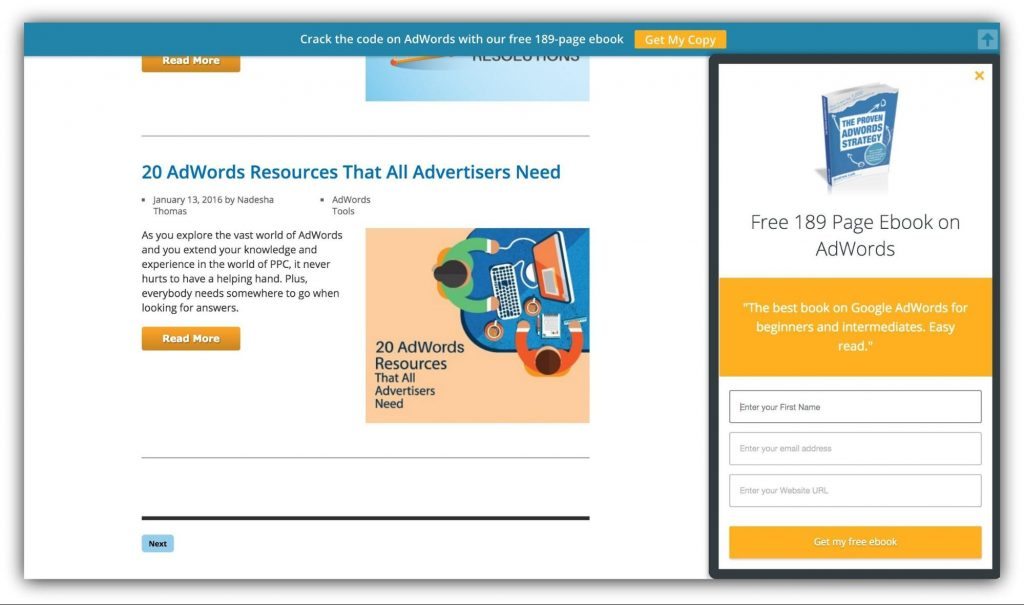
#6 Minimize Clicks to Subscribe
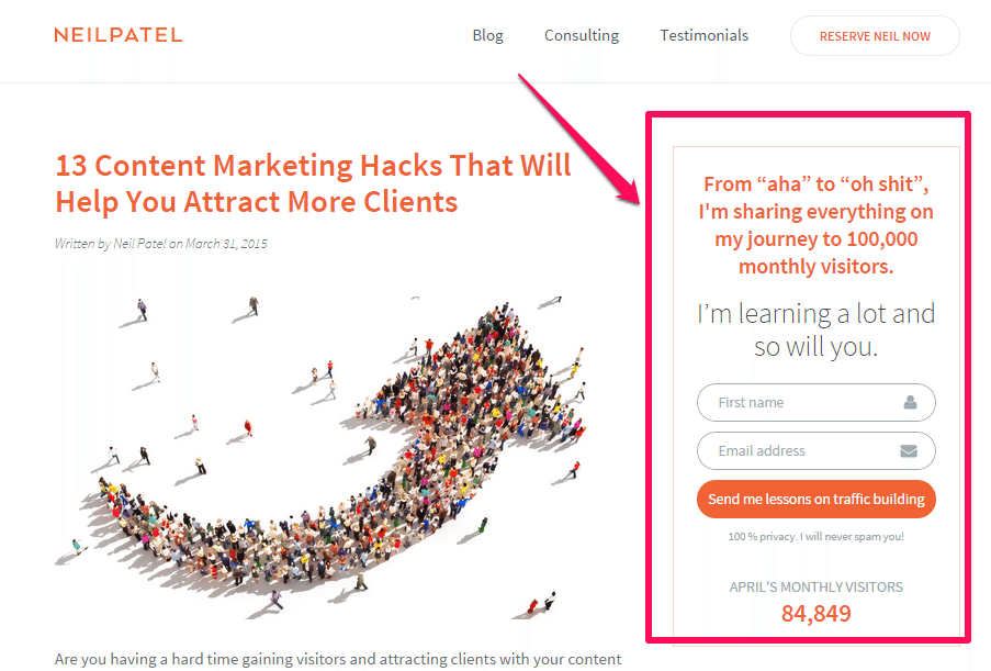
(Source)
As we can see in this post from Neil Patel, placing an opt-in form on the sidebar of your site is sure to get you more email conversions. Why? Because with a sidebar on each page, visitors will always be able to subscribe – no matter which page they land on. Make email signups easy on yourself and visors by using a simple sidebar widget available from AWeber, Getresponse and other autoresponder systems.
Note the visitors counter to communicate social proof, the security guarantee, the bare-bones email capture form, and the bold orange CTA to drive conversions.
#7 Offer a Special Deal at Opt-In
(Source)
An opt-in page as an excellent opportunity to present an exclusive offer to subscribers. Not only will your readers receive value but you’ll be reaffirming their trust in your brand and good things to come in the newsletter. This will reduce email list churn.
Giving benefits before receiving an email is a winning gesture. When making an offer, “free” is a power word sure to boost sign ups. Detailing the benefits in bullet form is also a great way to persuade more visitors.
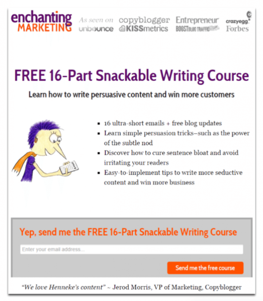
#8 Make Email Capture Forms Basic
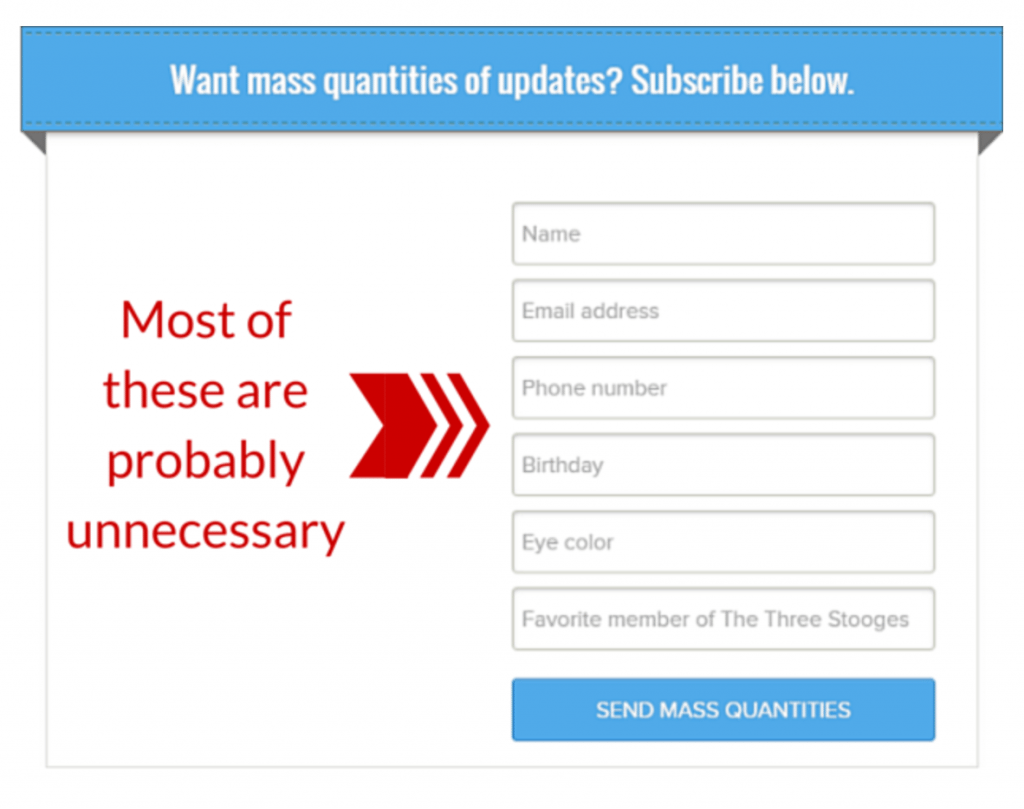
(Source)
“The most significant things we’ve done was re-designing our signup process to one page, and adding Google login, which is now used by more than half of the users.” –Otto Hilska, CEO of Flowdock
For email opt-in forms, less is definitely more. When readers wonder why you’re asking for extra information, you run the risk of losing an email signup. Opt-in forms that are pre-filled with instructions such as “Enter your email address here” make it easy for viewers to sign up for your newsletter. Simplifying your opt-in boxes reduces friction for visitors and translates into optimum email conversions.
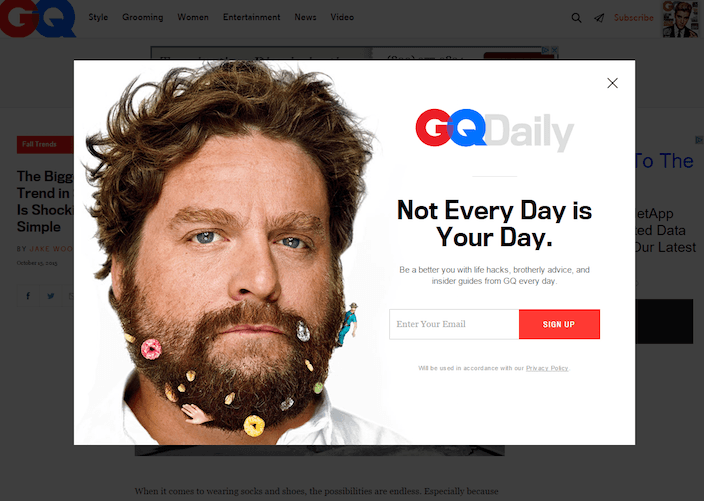
#9 Add Exit-Intent Popup
(Source)
Crazy but true: around 70% of people who visit your website will never return. But what if you could grab a few more subscribers from those leaving – would you do it? Heck yes! Use an exit-intent popup to grab a few more opt-ins from those abandoning your site. Exit-intent technology detects user visitor behavior and prompts them with an opt-in form when they’re preparing to leave. This way, you can swing back around and offer them a new dose of content the next time around.
#10 Add “Thanks for Commenting” Redirect
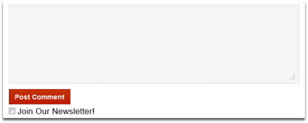
(Source)
The more you prompt your visitors to subscribe, the more conversion you’ll get. An often-overlooked way to nudge signups is in the comment section. Visitors who’ve left a comment are engaged with your brand are primed to opt-in. With one simple click, readers can join your mailing lists. Try out the AWeber Web Form Widget or the Yoast Comment Hack.
Both let you redirect commentators to a “thank you” and sign-up page for a quick subscription. Getting attentions while engagement is high is an opportune time to increase email opt-ins.
#11 Look at Successful Competitors
(Source)
It was Salvador Dali himself who said that good artists borrow, but great artists steal.
So don’t be afraid to scope out your competition and collect notes, rather take an in-depth look at their strengths, weaknesses, copy, and design. You’ll get good ideas for your own layout while gathering intel – double win. If a certain color of CTA button catches your eye, take heed.
If another site is not providing a certain something to visitors, can your brand rise up and fill that gap? Competitive analysis can shine a light on places that you need work (without A/B testing), and deliver fresh insights on how to outpace other companies in your space.
Converting the most email subscribers requires a diligent hand and a calculating eye that’s keen for good ideas – from anywhere.
[optin-monster-shortcode id=”rwodrlddnoz5wphi”]
We’re All Done For Now
As you might guess, history has shown me to be a better marketer than a clothing designer. Though my fledgling try with the Nice Banana blog never racked up many email subscribers, it wasn’t a slip-up. I learned that opt-ins must be ever-present and highly visible for visitors. While your WordPress site is surely more advanced than that first attempt 9 years, take these 11 tips home with you and see where you can apply them.
When trying to showcase your best content and boost your email list, a wide-angle approach to every little detail is what delivers the best results. While one of these tactics will help, try a handful and implement them all to notice a serious upswing.
If you’re feeling like seriously upswinging your subscriber count, take this whole bunch and apply them immediately. The conversions on your WordPress blog with go, ahem, bananas.